Brand Identity · Motion

G-Stories

Client Faculty of Design, HS Augsburg
Disciplines Logo, Visual Identity, Motion
Type University Project

01 — THE BRIEF

Redefining a Legacy

Germany's oldest design faculty faced an identity crisis. Its visual presence didn't reflect the institution's standing, creative excellence, or innovative spirit. A complete rebrand was needed — one that honored tradition while projecting forward-thinking design leadership. The challenge: Create a system flexible enough for diverse applications yet distinctive enough to stand out in an academic landscape.

Deep-rooted tradition meets cutting-edge design
Need for consistent identity across all touchpoints
System designed to evolve with the institution

G-Stories Logo — The Core Mark
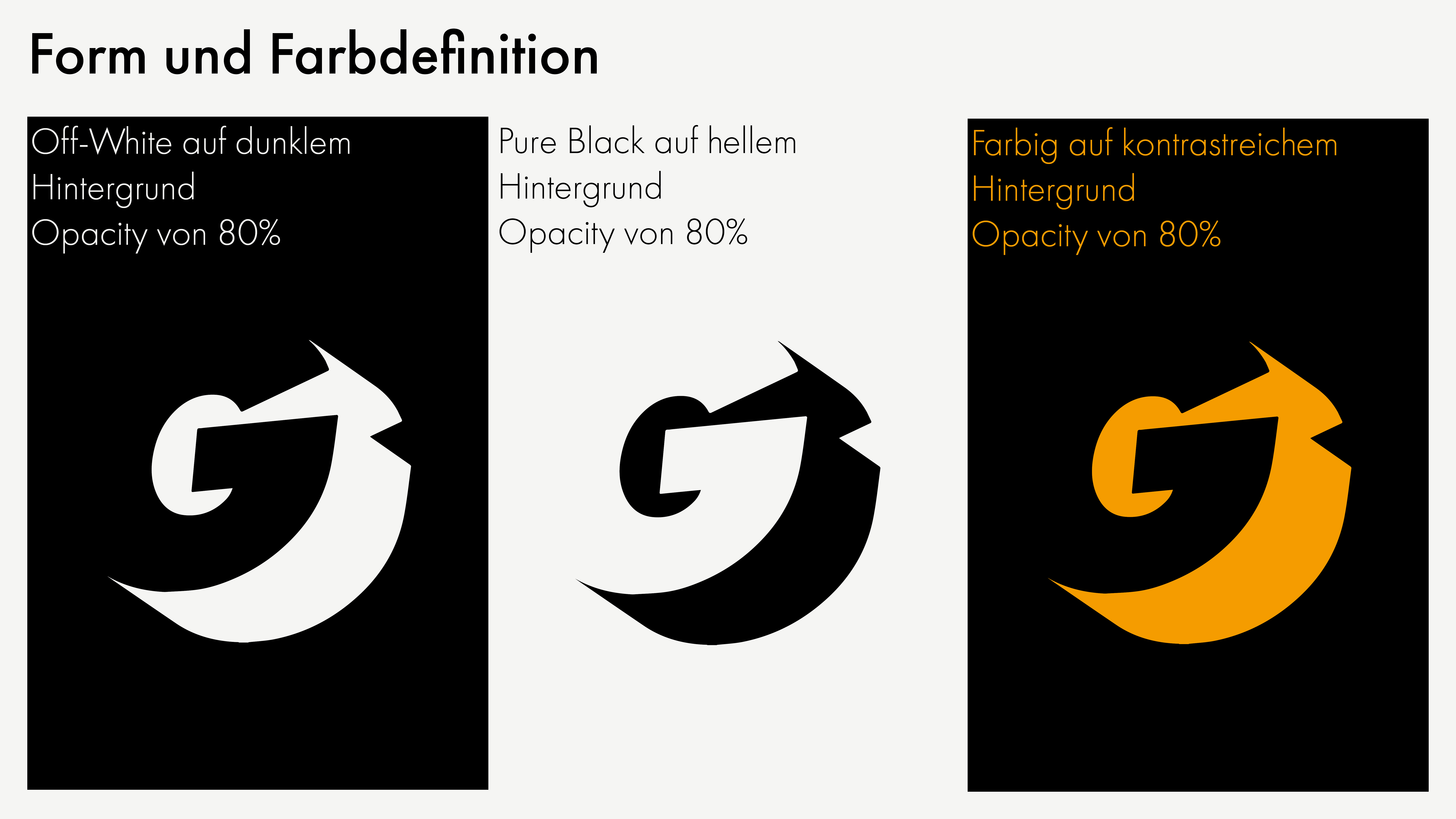
Design System — Typography & Color

02 — THE CONCEPT

Shadow, Depth, Substance

The design system centers on a single powerful concept: the shadow as metaphor. A transparent, semi-opaque 'G' (20% opacity) serves as the unifying element across all applications. This shadow represents depth — intellectual depth, creative potential, and the layered nature of design practice. It's a device that grounds the identity while remaining flexible and contextual.

Transparent mark system for infinite adaptability
Color palette reflecting both tradition and innovation
Rigorous typographic system for clarity

03 — DESIGN SYSTEM

Building a Cohesive Visual Language

The style guide defines rules across four critical domains: color systems, typographic hierarchy, imagery language, and layout grids. Each element works in concert with the shadow mark, creating a system that feels unified yet expressive.

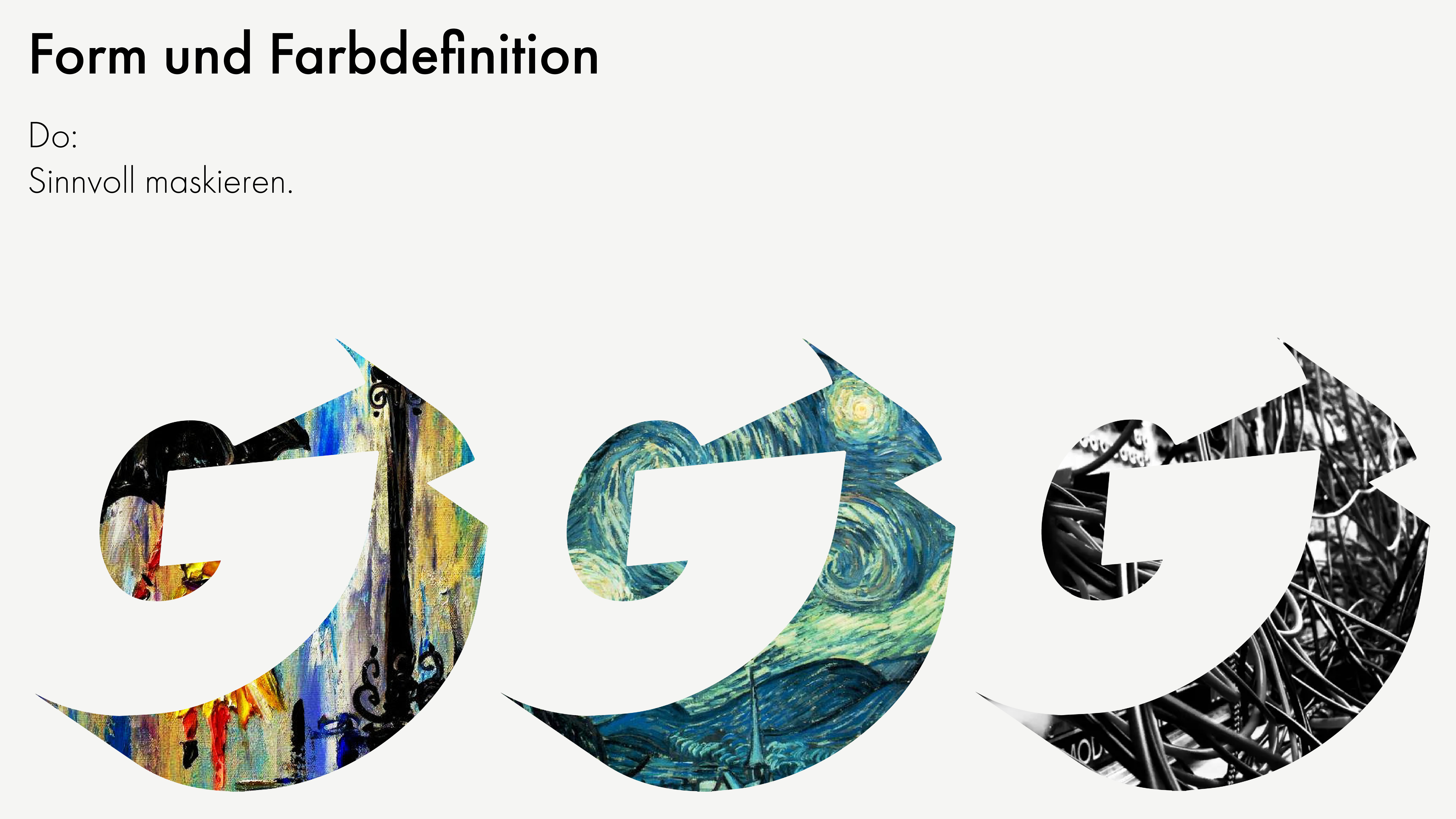
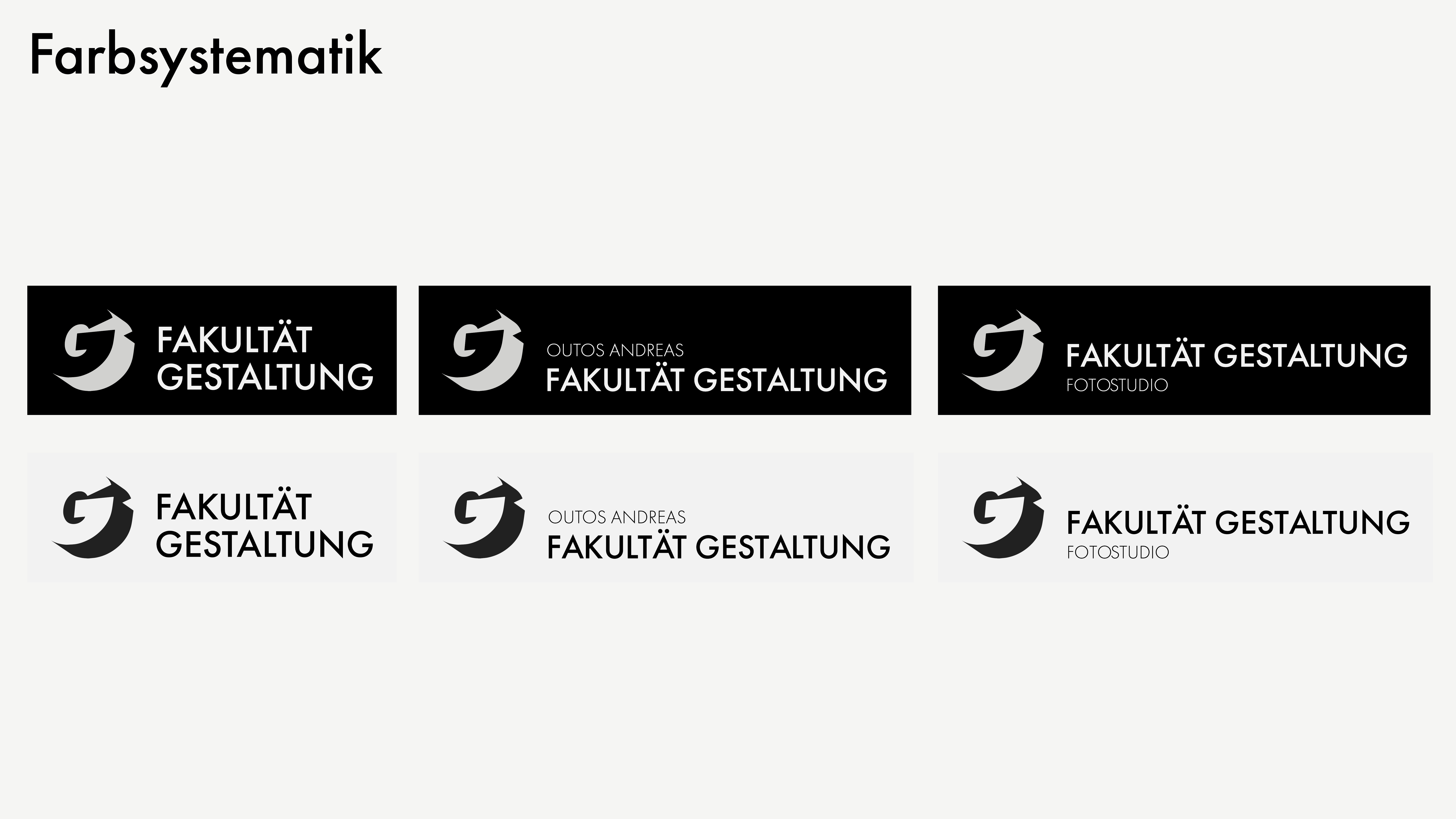
Color & Mask System Color Systematics
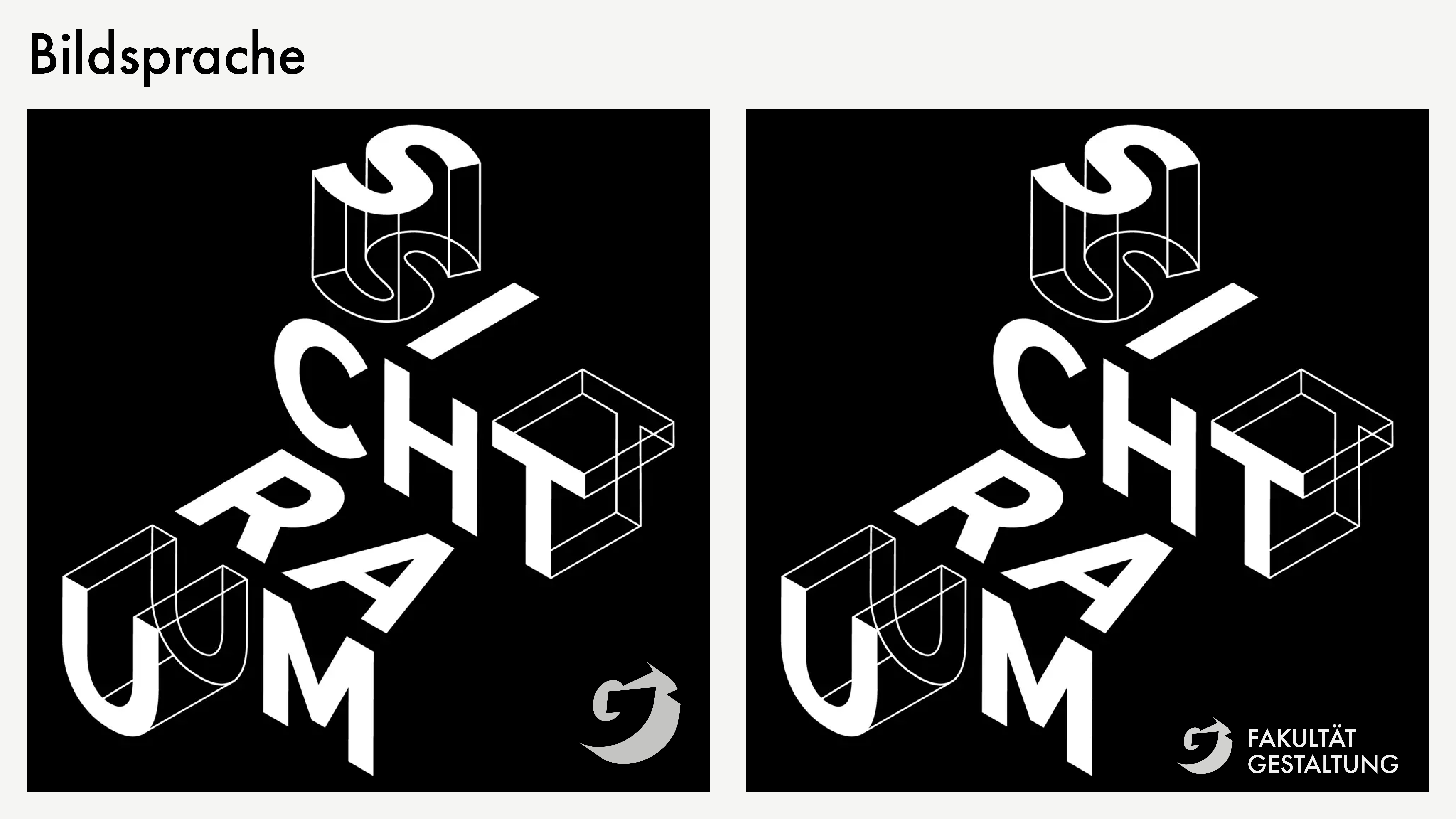
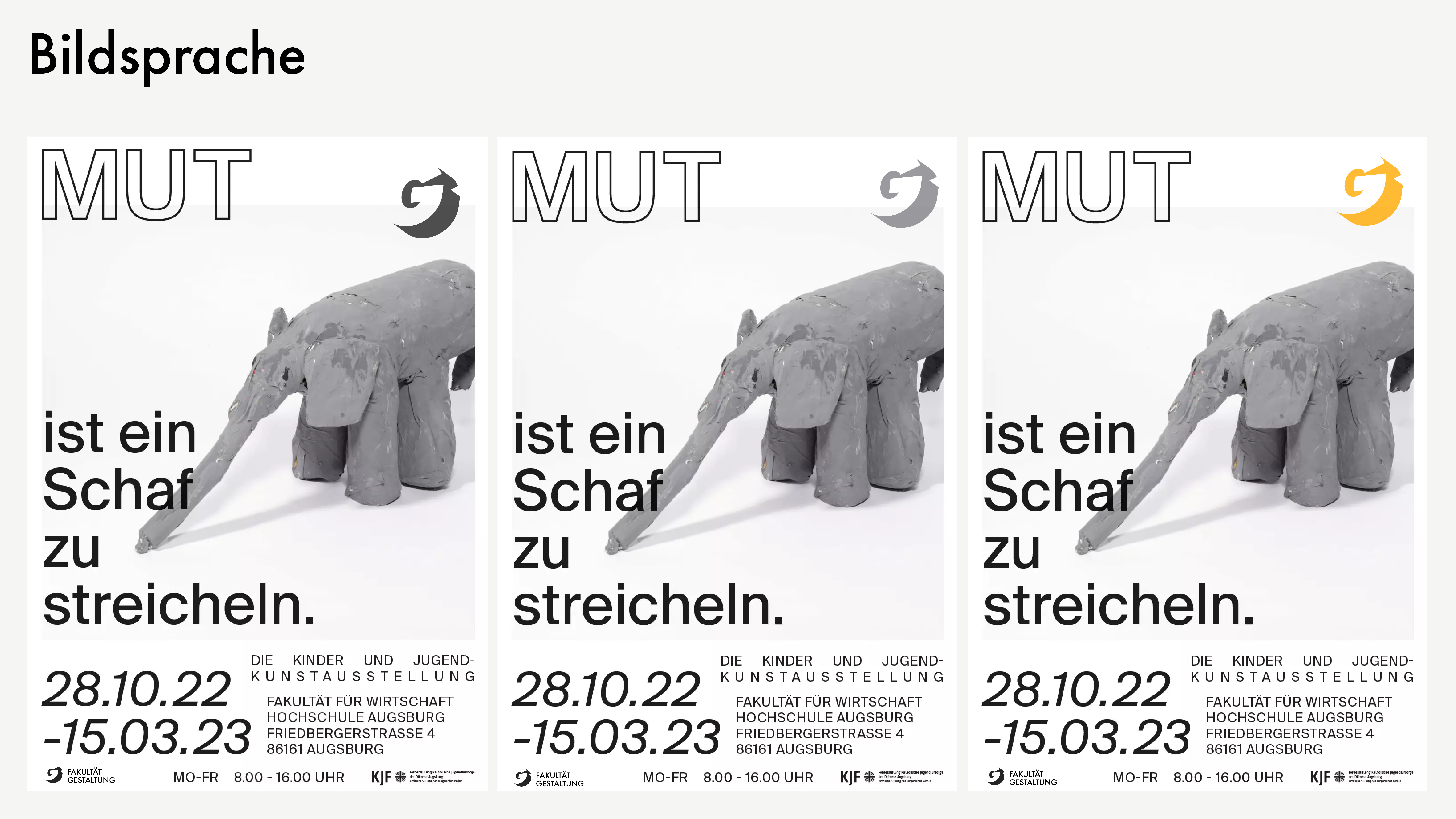
Image Language & Composition Poster Application
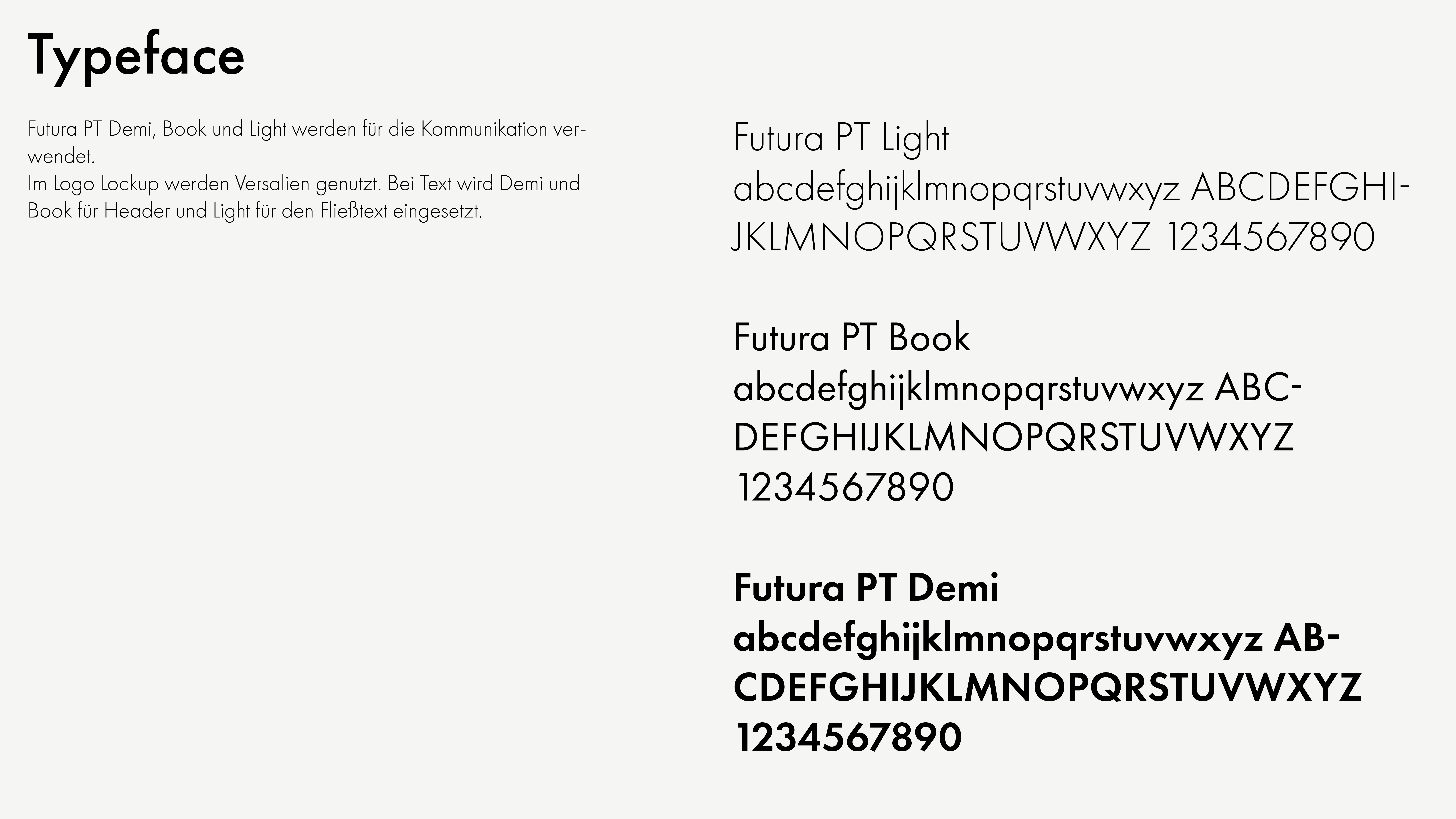
Typography & Typeface System

04 — MOTION & ANIMATION

Brand in Motion

To bring the static system to life, a series of animated logo idents were created. Each showcases different facets of student life — tools, techniques, and everyday moments that represent the faculty's diverse disciplines. The animations maintain visual consistency while celebrating the playfulness and personality of the institution.

Consistent brand language across motion
Playful yet professional tone
Flexible system for ongoing content creation

05 — IDENT LIBRARY

Flexible Animation System

Two complementary animation styles were developed: a concise 3-second ident for rapid brand reinforcement, and an extended version for more contextual storytelling. Both maintain the core visual language while adapting to different deployment scenarios.

Short Form — 3 seconds

Extended — Full narrative

06 — RESULTS & IMPACT

A System Built to Scale

The complete brand system was delivered as a comprehensive guidelines document, ready for immediate deployment across print, digital, and motion applications. The modular nature of the system ensures the faculty can evolve its visual language while maintaining brand consistency — supporting growth and change for years to come.

Comprehensive brand guidelines delivered
System deployed across all institutional touchpoints
Foundation for future growth and evolution
← Back All Projects